To get a better understanding of the impresso collection contents, you can plot over time the frequencies of articles, per newspapers, languages, topics or compare the total size of articles published in a newspaper, in a language.
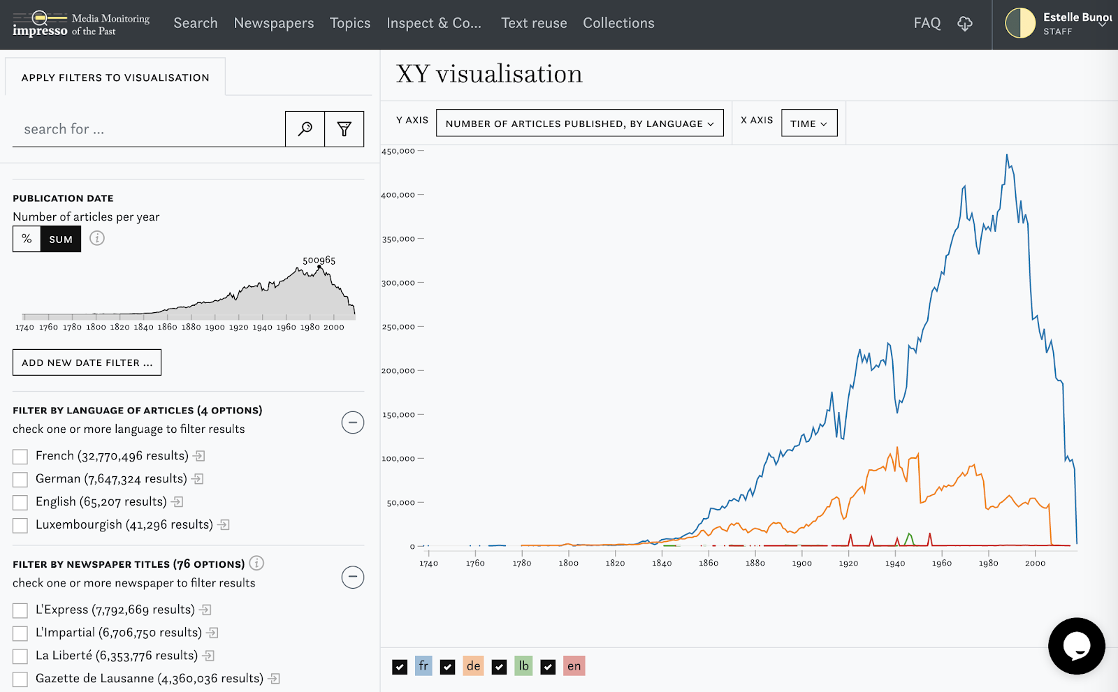
These visualisations can help you understand the distribution over time of the languages for instance, see below:
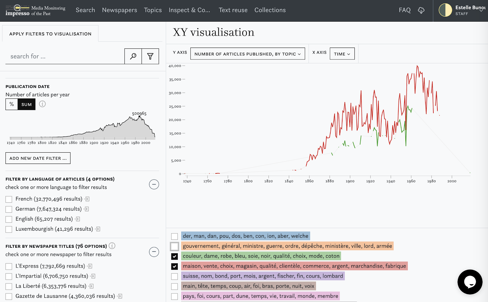
Please note that for the visualisation of topics or named entities, only the top 10 results are displayed. This means that in the following visualisation, we can see the top 10 topics present in the whole collection, and their presence per year, if they belong to the top 10 topics per year. In the example below, both green and red topics belong to the top 10 topics of the impresso collection, but are not part of the top 10 for each year.
You can apply filters on the visualisation to limit the selection of metadata to articles that contain a given word or a given topic, named entity.
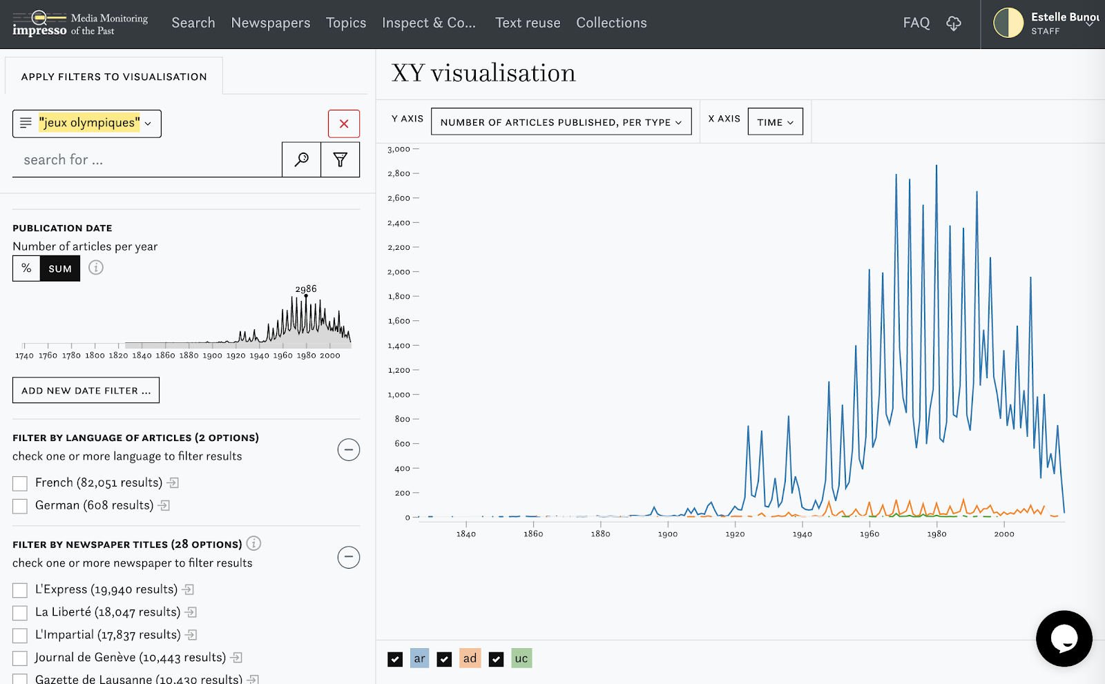
See below, the example of a query for the keywords “Olympic games” in French. Here we can see how the mean article type of articles containing “jeux olympiques” in the impresso collection evolves over time.
This visualisation enables also to look for co occurring elements: if you choose from the filters a person, location or topic, the top 10 co-occurring persons, location or topic will be displayed.
Links: Impresso Powervis